Responsive Web Design: Does Your Website Work Beyond Desktop?
2 Sept 20263 min read
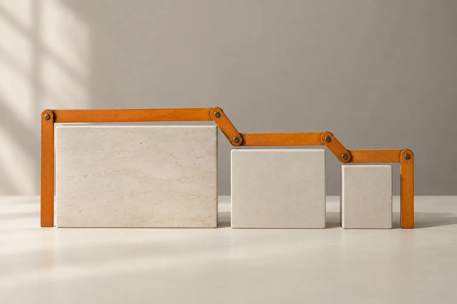
Your website looks good on the office monitor. A customer opens it on a phone and finds a heading cut off, a menu covering the page or a form that is difficult to complete.
That is the problem responsive design is meant to address. The layout should adapt to the space available while keeping the content and actions usable.
It is not just a smaller version of the desktop page.
What Responsive Design Means
Responsive design allows layouts, images and text to adjust across screen sizes. A row of cards might become a vertical list. A wide image may use a different crop. Navigation may change how it opens.
Mozilla's responsive design guide describes it as an approach to building for different viewing conditions, rather than a separate technology.
A menu icon is not proof that the job is done. A visible row of links is not automatically wrong on a phone either. What matters is whether the chosen layout works with the actual content.
Read The Page, Do Not Just Resize It
Open representative pages on a phone: a service, a long article, a product or project page and the contact form.
Can you read the text comfortably without pinching and dragging around it? Are headings complete? Do captions still belong to the right images?
Look for columns that become too narrow, text hidden behind decorative elements and cards with fixed heights that cut off longer content.
Use the real words and images intended for publication. A layout that works with short placeholder text may fail when the full content arrives.
Try The Important Actions
Open and close the menu. Follow a submenu link. Use an accordion, choose an option and move through a form.
Check whether the screen keyboard hides the field or button you need. Make sure error messages explain what to fix and remain visible.
If a gallery or carousel is included, test its controls without relying on mouse hover. Moving content should not prevent someone from reading or choosing.
For a store or application, test the complete journey using an agreed safe process. A tidy homepage tells you little about a difficult checkout.
Keep Useful Content Available
Mobile visitors still need the information required to make a decision. Removing product specifications, important conditions or contact details just to shorten a page can make it less useful.
Change the presentation when necessary. A long table may need a carefully designed scrolling area or a different arrangement, but the information still needs to be understandable.
Check that image crops preserve the subject and do not remove important visual context. Text placed inside an image can become too small to read even when the image itself fits.
Include Zoom And Accessibility
Screen size is not the only reason content needs to adapt. People may enlarge text or zoom the page to read it.
The W3C's guidance on reflow explains why content should remain usable when the viewing area becomes narrower.
Try enlarging the page and check that the header, buttons and text still work together. Ask your developer to include keyboard and assistive-technology checks in the wider accessibility review.
A responsive layout is part of accessibility, not a certificate that every accessibility need has been met.
Report Specific Problems
When you find an issue, record the page address, device, browser and the action you were attempting. Include a screenshot showing the surrounding context.
Describe the effect in plain language: “The submit button is hidden by the sticky footer” is more useful than “mobile is broken”.
Prioritise problems that prevent reading, navigation or enquiry before small visual differences. Ask for the corrected page to be checked again with realistic content.
The goal is a consistent, usable experience wherever someone opens your website, not identical screenshots on every screen.
Web DesignUser Experience

How Web Design And SEO Should Work Together
Bring SEO into website planning without writing for search engines. Start with useful pages, clear navigation and a careful plan for existing content and URLs.
19 Sept 2026 · 3 min read

How To Choose A Web Design Company For Your Business
Compare web design companies with useful questions about scope, relevant work, content, ownership, handover and the support you will need after launch.
24 Sept 2026 · 3 min read

How To Work With A Web Designer Without Endless Revisions
Prepare a useful website brief, give clearer design feedback and organise approvals. Practical advice for business owners and marketing managers.
27 Aug 2026 · 3 min read

Website Design For Service Businesses: Help Customers Take The Next Step
Help customers understand your services, trust your work and make an enquiry. A practical website guide for businesses that sell expertise, not products.
24 Aug 2026 · 3 min read