How To Review A Logo Before You Approve It
8 Aug 20264 min read
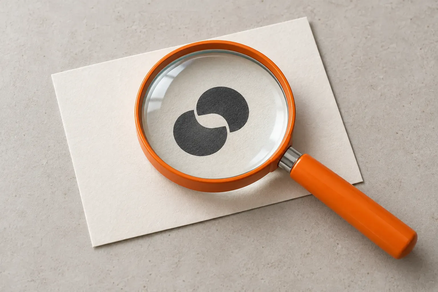
Before approving a logo, check whether customers can recognise the business name, whether the design works at the sizes you actually use, and whether your team will receive the right files and guidance. A presentation can show the idea. Everyday uses reveal whether it is ready.
Picture the logo in your phone's website header, on a quotation and beside a short social post. It needs to work in those ordinary places, not only on a beautifully lit sign in a design mock-up.
Start With The Job It Needs To Do
Agree what the identity should communicate before comparing designs. Who are you trying to reach? What should remain familiar to existing customers? Where will the logo appear most often?
Give the designer that context. A business with a long name and frequent tender submissions may have different practical needs from a shop whose sign is its main point of recognition.
Ask how each proposal answers the brief. You do not need a hidden symbol or clever visual trick for a logo to be useful. Equally, simplicity does not mean every business must use one shape, one colour or a short name.
Review It In The Places Customers Will See It
Ask for examples at their intended size, without enlarging them to inspect every detail. Start with the uses that matter to your business.
| Where To Test It | What To Check |
|---|---|
| Mobile Website Header | Can you read the name without the logo crowding the menu? |
| Quotation Or Invoice | Does it remain clear when printed in black and white? |
| Social Profile | Does the important part survive a small circular or square crop? |
| Dark Background | Is there an approved version that remains easy to recognise? |
| Signage Or Uniform | Can the intended supplier reproduce the important details? |
A long name may need a different arrangement for a narrow space. A detailed emblem may need a simpler small-size version. Ask the designer to show how those versions belong together, rather than shrinking the same artwork until it becomes unreadable.
Do not reject a design just because one mock-up is unconvincing. Identify what failed and ask whether the artwork, its size or the example itself needs changing.
Separate Recognition From Personal Taste
Instead of asking colleagues only which option they like, give them a task: read the business name, describe what they notice first, or find the matching logo among the proposed versions.
This is a practical feedback exercise, not proof that one design will increase sales. Listen for repeated confusion, especially a misread letter or a symbol that suggests something unintended.
Make comments specific. "The business name disappears at this size" gives the designer something to fix. "Make it more premium" needs a conversation about what you mean.
If you are updating an established identity, compare it with the existing one. Decide which familiar elements are worth keeping and which changes solve an actual problem.
Check Colour And Website Behaviour
Review the full-colour and single-colour versions. Ask which backgrounds they are intended for, and avoid relying on a special effect to make the mark recognisable.
There is no universal colour that makes every customer trust a business or buy a product. Our guide to choosing website colours explains how to give colours practical roles without relying on those claims.
The website implementation needs attention too. If the logo is the only content in a link to your homepage, its accessible name should identify that destination. W3C's linked-logo example explains this for people using screen readers. Ask your web team to check it in the finished header.
Confirm The Handover Before Signing Off
Agree what your team will receive, so nobody has to extract a blurry logo from a presentation later.
- Master artwork and suitable files for your website, documents and print suppliers.
- Approved arrangements for small spaces, light backgrounds and dark backgrounds.
- Guidance on colours, spacing around the logo and the smallest recommended size.
- Confirmation of the agreed usage rights and any separate font or asset licences.
- One clearly labelled folder and a named person responsible for keeping it current.
For the website, your designer may supply an SVG: a vector image that can scale without losing quality. MDN's SVG overview explains the format. Your web team should check the supplied file and choose the appropriate way to use it; you do not need to manage the technical details yourself.
Before final approval, bring the preferred design back into an ordinary page layout. During website design, the logo should sit comfortably beside the navigation, page headings and enquiry button.
The useful question is not just "Do we like it?" It is "Can our customers recognise it, and can our team use it consistently?"
Bringing your identity onto a new website? Discuss Your Website With Us.
BrandingWeb Design
Three Website Design Mistakes That Make Enquiries Harder
Review your website for unclear information, confusing navigation and awkward mobile journeys. A practical checklist for business owners and marketing teams.
30 Aug 2026 · 3 min read
How To Make Your Website Feel Like Your Business
Make your website reflect your business through consistent wording, images, colours and familiar actions. A practical guide for owners and marketing teams.
11 Aug 2026 · 4 min read
Five Circle Logos And What You Can Learn From Them
Explore circular logos from AT&T, Beats, BMW, the Olympics and Pepsi, and learn what shape, spacing and recognisable details can bring to a brand identity.
17 Sept 2026 · 3 min read
How To Work With A Web Designer Without Endless Revisions
Prepare a useful website brief, give clearer design feedback and organise approvals. Practical advice for business owners and marketing managers.
27 Aug 2026 · 3 min read