Web design is far more than just making pretty pages. It’s about fulfilling a purpose, to reach an objective. Here, we will share some of our best practices when designing a website specifically for food & beverage businesses.
77% of diners (surveyed by MGH) visit a restaurant's website before they dine in or order out. Among them, almost 70% have been discouraged from becoming customers because of its website. This is most likely due to poor and outdated design, which is exactly what we intend to avoid.
If you want a website built for a restaurant, cafe, bar, or of the sort, keep reading.
Define the objective
The first step in designing a website is not to think about how it looks like on screen. Instead, it should be answering these fundamental questions.
- Why does your website exist? What is its purpose?
- Why would people want to visit your website?
- What is your desired outcome of people visiting your website?
In the case of a restaurant, the answers are typically as follows, from the perspective of the visitor:
1. To make reservations
This would be the closest step your site visitor would take just short of becoming a customer. If you accept reservations on your establishment, then we would highly recommend to add this function on your website. The bare minimum would be to display a phone number on your site to call. But it’s even better to have a reservations function online for those who are not keen on picking up the phone. This also applies to ordering the food you serve online, if have such an offering.
2. To view your menu
Maybe someone wants to know what you serve, to decide ahead of time. Maybe someone has special dietary needs or preferences. Or maybe they want to see what your latest specials are. After all, businesses typically display their products and services on their website. A menu will be the equivalent of that for a restaurant.
A survey by Angelsmith revealed that more than 80% people looked for information about the restaurant online before deciding to go there.
That tells us you should give them the information they’re looking for, starting with your menu.
3. To see the ambience
It’s possible that your potential patrons would research you just to see what the interiors look like. They could be looking for a place to bring their family or loved ones for a special occasion. Which means they want to dine somewhere that matches their expectations in decor.
4. In summary, to decide whether or not to be a customer
This generally applies to any B2C website. People want to research before buying, and that would be the main intent for your first-time site visitors.
Determine the path to fulfill said objective
Once you know the why, then you think of how.
This part of the process will outline the must-haves in your website, to match the visitor intent determined earlier. It’s about what you need and how it appears on the website.
1. Place the Call-to-Action button on top
As soon as the site loads, visitors should already see the button to make a reservation or order online, without having to scroll further. This is because you want to close the gap between visitor and customer as tightly as possible. Also, it could be their second or third time visiting you. For them, they won’t need to see the rest of your site contents.
Also, place the button at the bottom. For those who take the time to view the content on your page, “Reserve Now” would be a call to action to close it off.
Note: to reiterate, this applies only to places that accept reservations
2. Make the menu easily accessible
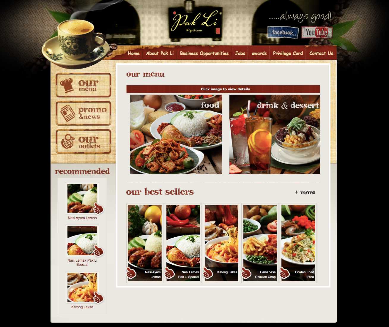
Some restaurants make the mistake of uploading a PDF version of their printed menu on their site. This translates to very poor user-friendliness. Nobody should need to download a separate file just to view text and pictures. Just have your entire menu populated natively on your site for easy reading.
 Pictured: the website we designed for Pak Li Kopitiam features a full menu complete with pictures for every item.
3. Have lots of pictures
If your interior design is part of the attraction and charm of your outlet, then be sure to display many beautiful photos of them. If you have a large premises with many parts, then create a gallery section on your site to show all of them off.
If your menu items are the bigger attraction, then show pictures of those instead.
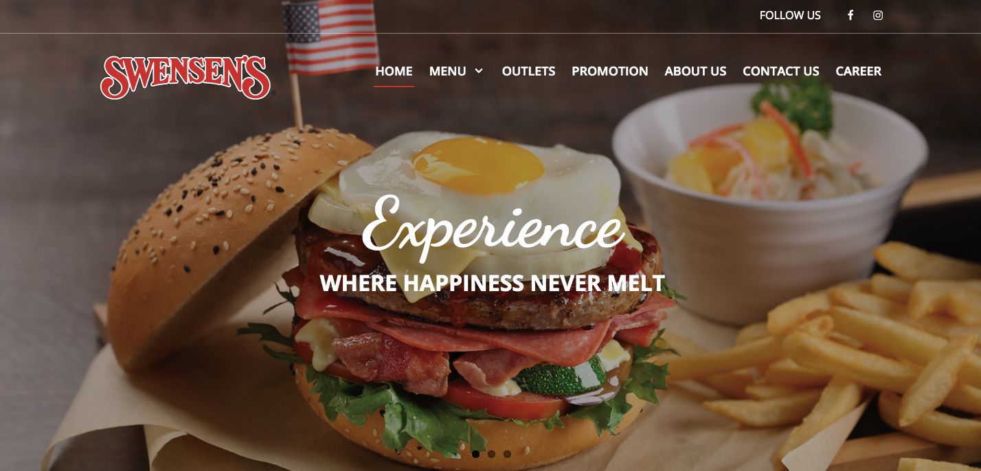
In the same survey by MGH, almost 60% of 18 to 24-year-olds and 55% of 25-34-year-olds specifically look for photos of food on a restaurant's website.
 Pictured: the website we designed for Swensens features beauty shots of their menu items.
4. Add content to attract customers
As your potential customers research you, you want to give them as many reasons as possible to become one. If you have any of these, show them prominently:
- Ratings from platforms like TripAdvisor, Yelp, or Google Maps
- Testimonials from past patrons
- Photos of celebrities who have been customers before
- Awards and press coverage
The rest is art
Only after you fulfill the objectives of your website, do you think about its look and feel. Now you can determine things like colours, fonts, visual elements, and even the personality of the writing. Which should all be consistent with your other marketing materials and branding.
Conclusion
These are just some of the things to consider for your restaurant website. Other things may be unique to your business, which requires a collaboration with designers.
We can help you design your restaurant website to serve a real-world purpose.
Why choose Orangesoft?
Orangesoft has developed 500+ websites with practical design in mind since 2007. We offer:
- Practicality for user and marketing friendly websites
- Security and scalability on Drupal platform
- Specialists with in-depth knowledge
- Dedicated support teams after launch